Bauhaus Design Provides Winning Inspiration For Design Students

blog2

Taking design students out of the ‘digital’ classroom and into the noisy, machine-driven world of mechanical printing provides an insight into the process that can turn a plain piece of paper into a work of art.

For the fourth year in succession, and narrowly avoiding ‘cancellation by coronavirus’, Baddeley Brothers hosted two students from Ravensbourne University in South London for ‘Im–print! Im–press!’ – a now-regular feature of the uni’s design curriculum that incorporates the whole process of coming up with a design, through planning, costing, and finally production.

The live-brief got teams of students from different design courses to explore the relationship between paper and printing processes as well as the context of the people within the process, designers collaborating with printers, students with professionals, and the actual workflow of a costed production process.

Graphic Design student James Ranger from London and Rachel Chambers from Hampshire were winners of an elective unit involving 60 students from the Department of Design Practice at Ravensbourne University earlier this year.

The university has collaborated with London printers Baddeley Brothers, paper merchant G.F. Smith and foil specialists Foilco, and James and Rachel were tasked with creating a paper object installation inspired by the G. F. Smith Gmund Bauhaus black and white paper range.

The Bauhaus, an early 20th century German Art School, had a profound effect on modern design and played a key role in the students’ research and reflections. The paper described as ‘modern, straight forward and reduced to the bare essentials’ amplified this message. Bauhaus, an early 20th century German art school which had a profound effect on modern design.

The paper, budget and finish specifications create an interesting exercise in limitations and freedoms, since there were absolutely no restrictions on images, typography or other graphic elements.

James said “It was an interesting topic to explore. We had to create a paper structure which uses foiling and other graphic design and physical techniques to build something that would have the essence of the Bauhaus and that movement.

“A lot of the original art and photography of the Bauhaus, during its early days, really experimental structures relating back to the Golden Ratio which is a geometric pattern you find in nature.

“So often, all our work is done on computer, I learned a lot about working with foil, and it was interesting to learn how the software we use in a design course setting differs from that in a production environment.

“We built a modular polygon design. It looks like a steeple and has silver foiling going all around it. What’s cool about it is that you can stack the pieces on top of each other. It’s quite a basic shape and expands from there.

“We wanted to have some natural theme in ours, so the foiling design is like water rippling.

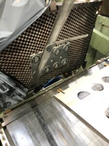
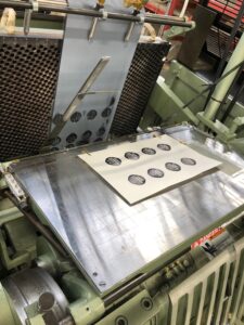
“Baddeley Brothers talked us through the best way to use paper, what weight of paper to use for different part of the creation. We went to their factory and watched them putting it together.

“We really like the way it came out. It was like working with Lego.”

Rachel, who is study fashion buying and brand management, said: “It was more hands-on than I expected. It was so different to what I do on my course, and I wanted to push myself to do something that I wouldn’t usually go for and it worked out pretty well.

“Whilst we were developing the piece, we realised there were so many ways it could form, which made it something special.

“We wanted to be really careful to enhance the material because it looks pretty.

“And the feedback we got was that we actually managed to celebrate the foiling as well as the paper. We had brought them together with just the right balance.

“Baddeley Brothers were amazing. Throughout the project they came in and give us an insight into the machine they’d be using. And seeing it all working in the factory was really quite cool.

“It was all very fiddly to make. It was a case of trial and error. We went through so many stages. There was lots of things that didn’t work!

James and I quickly realised we shared the same vision that we wanted the end product to be perfect. We worked well together.”

The piece will go on display in the GF Smith show space. Although the design was completed before lockdown, and some of the printing done, the final ‘construction’ stage has yet to be done.

Maaike van Neck, Course Leader BA (Hons) Graphic Design, said: “We’re so lucky to have this ongoing collaboration with Baddeley Brothers, G. F. Smith and Foilco. Every year the project changes but the challenges remain the same: how do you explore creativity within constraints, may they be budget, format or production related. This live brief has a lasting impact on the students who engage with it. This is evident in the self-initiated projects in Year 3 and the career choices graduates make when they leave Ravensbourne”

Commercial director at Baddeley Brothers, Charles Pertwee added: “It was really satisfying to work for the fourth time with students from Ravensbourne again. James and Rachel were worthy winners this year, it was clear they bounced ideas off each other, developing their ideas and learned from their experience.

“The effort they put into perfecting their design, reiterating the finest details until they were just right is exactly the same principles that have kept our company going for 160 years. Attention to detail is such a desirable quality for young people to have as they embark on a working career in design, and the two have demonstrated they have what it takes.”[/fusion_text]

Historic Wood type inspires new Brand Identity for East London Brewing Company

rsz img 1132 e1575384239482
Webp.net resizeimage 2
Evolving the brand of East London Brewing Company

A Decade of Brewing

After nearly a decade of brewing high quality, popular British beers, the husband and wife dream team behind the East London Brewing Company are evolving their brand, to stand out in an increasingly competitive national and international market.

Webp.net resizeimage 6
On the press

Founders Claire Ashbridge-Thomlinson and Stu Lascelles asked designer Clare Skeats to refresh their ELB logo, retaining its roundel device and building on the brand’s East London roots. Her journey through East London began at an artist-run, open access studio.

Clare explained: “East London is known for its industrial past, which resonates today in the form of the many makers and artists who are based here – some of whom are reviving traditional crafts and skills. This also connects to what East London Brewing Co themselves are doing within the craft of brewing. I decided to work with Simon Goode at the London Centre for Book Arts, in Hackney Wick, which was once the heart of London’s print industry.

I had the idea to reference the typographic language of East London’s industrial heritage; the robust grotesques that were commonly found around the docks and railways in the 1800s. Luckily, amongst LCBA’s collection of wood type, I found the perfect letter forms, which Simon and I letterpress-printed to form the basis of the logo.

Technological Challenges – The Physical into The Digial

“Translating a physical piece of print into workable digital files was quite challenging as I needed to create a large suite of files for various contexts. I generated scale-specific versions where the letterpress texture is present (as seen on the can and bottle labels); and then ‘cleaner’ versions for more general applications, but which still retained the character and irregular qualities of the wood type.

Traditional Industrial Craftsmanship – Strengthening your Brand

Webp.net resizeimage 5
Industrial craftmanship

“I recommended that the printing of the logo on business cards and compliments slips should be handled by Baddeley Brothers, as I knew that Claire and Stu would be drawn to its long history in the area, and I also knew them to be fantastic printers and finishers. As I had hoped, the foiling is wonderfully crisp but the character and the imperfections of the original type forms are still there – so I couldn’t be happier with them!”

Director of East London Brewing Company Claire Ashbridge-Thomlinson added: “We have always been seen as a solid, quality and reliable brand and that is something we wanted to hold onto – so collaborating with an authentic, high quality East London printer was the natural choice for our brand. We are all about supporting our local economy and celebrating all that this area stands for.”

She goes on to say that “Now Baddeley Brothers is part of our story too, helping us deliver the contemporary taste and texture of East London to the world, using traditional industrial craftsmanship.East London through and through, Baddeley Brothers has done the most beautiful job on our business cards and the foiling is simply gorgeous.”

Increased collaboration and continual innovation

Baddeley Brothers Director Chris Pertwee said: “Claire was looking for a high-quality grey stock that captured the industrial heritage of the brand.
We recommended Colorplan pale grey 135 gsm for the compliments slips, with foil blocking in gloss black.
We then used duplexing to create the perfect finish and weight for the business cards, using two layers of Colorplan pale grey 175 gsm, again with gloss black foil on both the face and reverse of each card.”

And the collaboration will not be ending there as Claire has plans to use Baddeley Brothers’ other printing skills to add an exclusive feel to some of the exciting new products planned for 2020!

Visit East London Brewing Company, Clare Skeats or Baddeley Brothers for more information

Impressionable arts at Chelsea’s student show

Highly creative arts student Ann-Marie Millward, a former intern at Baddeley Brothers, is showcasing her design talents at the Chelsea College of Art and Design’s BA Show until 22 June 2013.

And nestled in a custom-built steamer trunk, featuring an enticing display of fabrics and materials bearing Chlandi patterns, two delicate sheets of embossed and debossed paper can be seen. Having immersed herself in the skills of Baddeley Brother’s craftsmen and learned the unique properties of each specialist printing technique, Ann-Marie immediately spotted the huge potential of embossing and debossing to highlight and complement the traditional Chlandi patterns that inspired her.

She said: “I’m delighted Baddeley Brothers was able to help me by providing these sheets – they really add an extra dimension to my display. I loved the synergy between the traditional craft of embossing and the artistic process of creating Chlandi patterns.”

As well as forming part of her artwork at the Show, the sheets will form a key part of her portfolio as she starts her career as a designer. “Bright, highly creative and intuitive,” said Director Charles Pertwee when asked to describe the former intern. “Her work is off-the-wall and incredibly detailed – we were lucky to have her on board last year. As she starts her career, we’re delighted to give her a hand by bringing her 3D vision to paper.”

Having A Ball

having a ball 1

Baddeley Brothers engraved plates featured in TV documentary. Two authentic copper plates engraved by Baddeley Brothers are to feature in the opening sequence of BBC Two’s celebration of the 200th anniversary of one of the world’s most enduring love stories, ‘Pride And Prejudice: Having a Ball’ on 10 May 2013. The programme recreates the opulent … Read more

Your invitation to Leclettico

Epic in scale and ambition, the Handmade show at Milan’s Salone 2013, drew extensive attention from the world’s most influential creatives, who were enticed by intricate die-stamped silver invitations offered by the legendary design magazine Wallpaper*. Printed for the third year running by Baddeley Brothers, this year’s invite was enhanced with letterpress, blind embossing and … Read more

Write Now in ELLE Decoration

Nestling between a luxury bottle of Waterman Paris ink and a brass pencil by Midori, a sleek save the date card, designed by Charlie Lester, and a handmade string and washer envelope from Baddeley Brothers is featured in May’s issue of ELLE Decoration, as one of this month’s Best Buy. Stylishly photographed by Beate Sonneberg … Read more

Pearlfisher – Fearless Approach to Design and Print

International creative branding agency Pearlfisher is celebrating 20 years of powerful design with the launch of ‘Have No Fear’, a limited edition perfect-bound book produced in collaboration with printing specialists Baddeley Brothers. A testament to the firm’s fundamental belief in risk-taking creativity, the exclusive book presents 20 powerful statements using strikingly simple typography, a minimalistic … Read more

Planes pop-up in Covent Garden

BB54Paper Planes at Gallery Fumi

They will all be found under the Christmas trees of many discerning design-lovers this year, who have discovered them in an exciting pop-up shop in Covent Garden selling limited edition works of art and design. Open for just one month, The Temporium, has been showcasing unusual collections from twenty of the UK’s most exciting and … Read more